AXON
A more adaptable control bar design that improves usability in tight screen spaces, making the Axon Evidence Player 2.0 easier to use on smaller displays.
Background
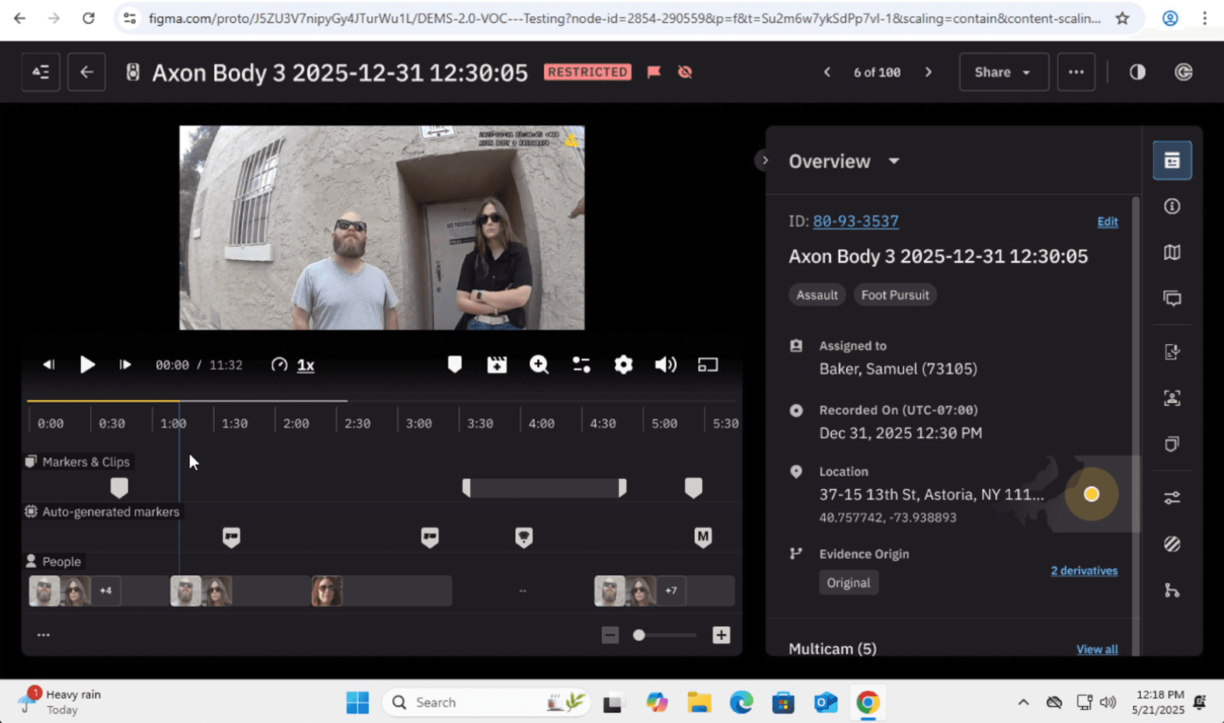
In May 2025, our Mixpanel data shows that although 1920×1080 is the most common resolution, a large portion of evidence reviewers still work on smaller screens. Resolutions like 1366×768 contribute over 25,000 Player views, and many devices fall below 800px in height. At these sizes, the timeline takes up too much vertical space and the control bar becomes crowded or clipped. This project focused on two fixes: a collapsible timeline and a reorganized control bar, designed for responsive scaling behavior on smaller displays.
MIXPANEL data: screen sizes breakdown


On smaller displays, the timeline and control bar occupy most of the vertical space, limiting the area available for video review
What we needed to learn
We set out to understand how reviewers expect the Player to behave on smaller screens. This included preferred collapse behavior, whether the Player should load expanded or collapsed, how controls should be reorganized to stay visible, and whether these changes actually improved small screen usability.
Approach
We ran two rounds of research to evaluate how our proposed changes should behave on smaller screens. The first was a live Customer Hour session in late July, followed by a broader survey in early August. Both focused on how reviewers expected collapse interactions to work and how controls should respond when space is limited.
Collapsible timeline to reclaim vertical space
Clearer control bar grouping to reduce confusion at smaller breakpoints
Checkpoint 1: Customer Office Hour (July 2025)
Sixteen participants evaluated the three collapsible options. Option 1 was preferred because it stayed closest to the main playback area and required the fewest clicks.

Timeline collapse variations tested during Customer Hour in july 2025
Checkpoint 2: Follow up survey (August 2025)
A broader survey in early August with 50 participants confirmed that Option 1 remained the strongest choice across a larger sample.
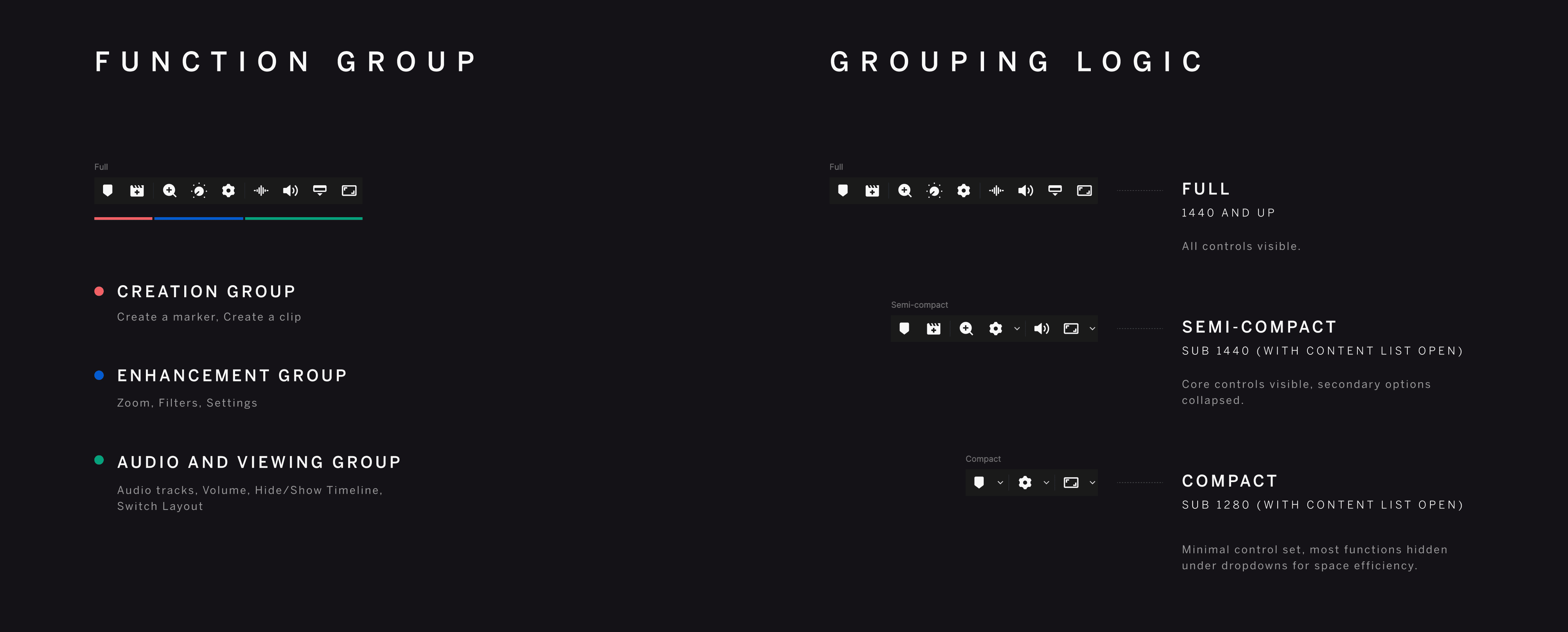
Control bar grouping model
To keep the Player consistent as space becomes constrained, we organized controls into functional groups rather than treating the control bar as a single row of actions. This allowed essential controls to remain visible while secondary actions progressively collapsed as available space decreased.


PROTOTYPE VIEWER FOR THE FINAL OUTPUT, WITH 3 SIMULATED SCREEN SIZES
Findings
The findings below combine both sources and focus on what mattered most for small screens: a clear collapse action and consistent behavior as the timeline opens and closes.
Option 1 was consistently preferred across both research activities. Users described it as the simplest interaction, closest to the main video area, and least disruptive to their existing workflow.
Preferences around default timeline behavior were more mixed. Responses were split between always expanded, always collapsed, and context dependent behavior. Reviewers emphasized that the right state depends on their workflow, device, and whether they are actively scrubbing the timeline.
Combined preference for Timeline collapse options
quotes from customer hour session
How this guided the roadmap
These findings shaped how Player 2.0 responds on smaller screens. They clarified how the timeline and controls should adapt as space becomes constrained, and gave the team a consistent model to build on for future in vehicle focused work.
A simpler collapse interaction
The preferred option became the default behavior for how the timeline opens and closes on smaller screens, reducing friction during review.
A clearer responsive structure
The work established consistent breakpoint rules so the Player behaves predictably as layouts transition from compact to full.
A more focused control bar
Grouping related actions reduced visual clutter and produced a control bar that scales cleanly for MDT constraints without hiding essential actions.
PASSWORD PROTECTED CONTENT
Enter passcode to continue
PREVIOUS PROJECT
Smart Analysis, built with AI (2025)
CREDITS
Anh Quan Huynh (Design Lead)
team
DEMS / Playback Experience
NEXT PROJECT
Coming Soon

