Grab

Grab Express needed a clearer, more intuitive delivery flow, so the redesign simplified sender decisions, reduced booking friction, and grounded each step in real courier behavior.
Background
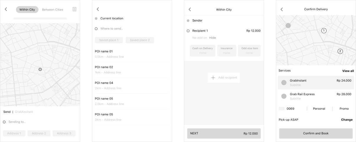
GrabExpress has long been serving Grab users by providing a simple, straightforward logistic service. However, from the current data of GrabExpress booking conversion funnel, the team was able to identify major drop-offs which results in Grab losing potential revenue.
The current user journey also requires a lot of data inputs and neither optimized for conversion nor user friendly. The flow also suffers from scalability issue, unable to accommodate upcoming features in an intuitive manner.

GrabExpress UX as of June 2020
Project Goal
The redesign aimed to strengthen both sides of the GrabExpress ecosystem. For businesses, the objective was to lift the Book-thru Rate by 3%, a change projected to drive an estimated 5.5% increase in revenue. A key focus was reducing drop-off points across the flow, particularly between the Home screen, Recipient Details, and Checkout.
For Grab users, the goal centered on creating a noticeably more streamlined delivery experience. By cutting unnecessary steps and minimizing time spent at each stage, the flow becomes easier, faster, and more intuitive. The new experience accommodates the diverse needs of our user personas including social sellers, corporate senders, and everyday personal use, ensuring each group can complete deliveries with less friction and greater confidence.
User Personas
With help from our UX Researchers and Data analysts, through qualitative researchs and studies, we were able to define the 3 archetypes for our product:

The Personal User
Basic delivery needs (deliver to friends or family)
Delivers one item at a time
Need to book a delivery as soon as possible
Price sensitive

The Social Seller
Sells goods on social media
Uses multiple delivery apps to get cheapest price
Accepts Cash on Delivery (COD) as payment
Needs to share delivery fee with customers

The Enterprise Retailer
Advanced users with highly customized use case
Not price sensitive
Sends valuable items
Can schedule delivery for pick up later
Pain Points and Opportunities
By analyzing our research insights, we identified the key pain points across the GrabExpress experience and outlined opportunities for improvement.
Pain Point
Sending a parcel requires too many steps and too much effort, especially when comparing prices or starting over.
Service options are unclear, leading to confusion and poor conversion.
Tracking is hard to find and feels inconsistent between web and native app.
Opportunity
Show an instant price estimate from a single drop off input so users can make decisions quickly with minimal effort.
Suggest the most relevant service type based on user inputs and preferences instead of expecting users to interpret all available options.
Simplify the Delivery home screen and booking flow so users can easily book or track a delivery, improving NPS and retention.
Design Objectives

Scalability
Be able to accommodate the future expansions of Express, new features and services.

Usability
Create a meaningful and effortless journey by lightening the cognitive load.
Delightful
Craft an inspiring and delightful experience for users.
Iterations
I started with a low fidelity exploration that merged aspects of both Express and Transport, borrowing what worked in Transport to see how it could enhance the Express experience.
v0 design
The feedback made it clear that my initial concept did not meaningfully address the core problems. It improved a few parts of the old flow but not enough to justify calling it a revamp. Since it added little beyond the existing experience, I decided to rework the idea entirely.
Another long standing issue also surfaced again. Users would still be expected to understand every Express service and choose the right one on their own. In reality Grab offers almost one hundred and fifty variations across regions, many of them minor tweaks of the same service. Instant delivery and Instant delivery with multiple stops are just two familiar examples.

v0.5 design
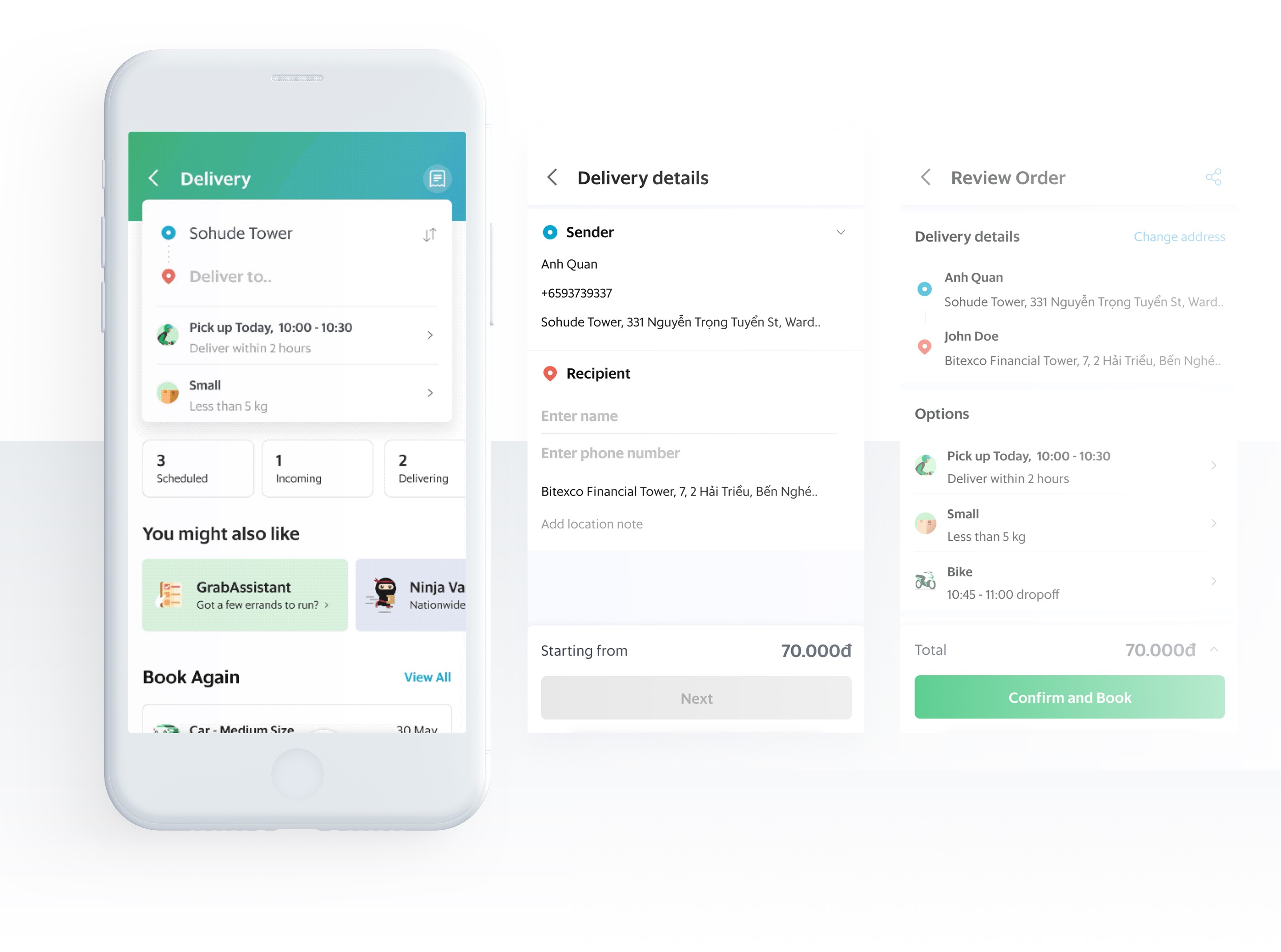
In the next revision, I introduced a dedicated Express Home screen that users land on after tapping the Express tile. By grouping related services and adding direct entry points like Delivery History and Book Again, the goal was to give users more ways to access what they need. This shift also updated the overall mental model of how Express works.
Before
I need to deliver something from point A to point B.
Now
I need to deliver something from point A to point B.
I want to send something light/heavy and i have a specific request for this delivery.
I need to track my current delivery status.
I want to quickly book again without having to fill all the details.
I want to view my past bookings.

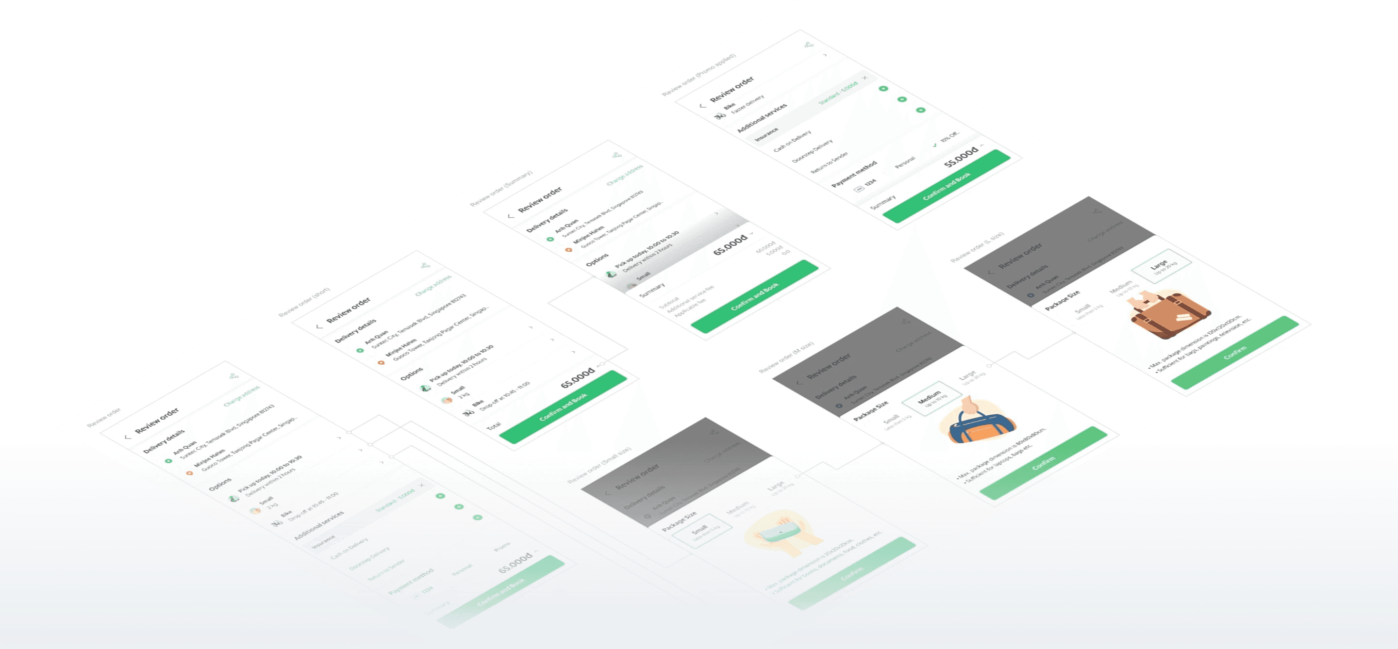
Other hi-fidelity explorations
Final Design
FINAL OUTPUT
Validation
Usability Testing
We did a 2-days usability test with 6 participants in HCMC, all of the participants fit our user persona profiles. Participants were recruited by our partner research company, with various backgrounds and ages, occupations etc.
There are 4 total testing scenarios. Participants would have to:
1. Book a delivery to send a parcel from address A to B
2. Book a delivery but as a Recipient
3. Book a delivery for pick up later (schedule a pickup)
4. Book a delivery that is not urgent and within certain price range

MODERATED USABILITY TESTING SESSIONS
Methodology
While participants used the prototype, we asked for feedback on the new Home screen, the components that surfaced features they previously missed, and the clarity of the updated booking flow.

You can view the prototype we tested here.
Key Insights
Participants responded well to the new and expanded services such as Schedule Delivery, Book Again, and Car delivery.
The price range format created some confusion at first, especially the Low bike price and High car price labels. Once users moved through the flow and saw the actual bike and car prices, the range began to make sense to them.
Price was not a major blocker. Users were willing to choose options like Car delivery or add Insurance if it meant getting a better service, even at a higher cost.
All six participants rated the overall booking experience between 8 and 9 out of 10.
FINAL DESIGN
PREVIOUS PROJECT
GrabFood Reorder and Promo Discovery (2019)
CREDITS
Anh Quan Huynh (Co-lead)
team
Grab Design / Deliveries
NEXT PROJECT
Embedded Livestream Player (2023)