Grab
GrabFood’s Growth team ran rapid experiments to improve acquisition and engagement. The work validated high potential ideas and set the foundation for long term features.
Background
From the beginning of 2019 until September, I joined the GrabFood team as part of the Growth workstream. At Growth, we worked to improve acquisition and engagement across Eaters, Drivers and Merchants by validating high potential ideas through product experiments while keeping a longer term mindset to support future feature development. Two of the key initiatives during this period were Food Reorder and Promo Visibility for GrabFood users.
The Driving Metrics
Acquisition
Traffic to GrabFood
Order Completion
Engagement
Revisits to GrabFood
Engagement Rates
Time Spent
Others
Perfect Journey
NPS
GRABFOOD IN 2019
Problem Statements
Through NPS report and in-depth competitor analysis, we identified the following pain points and brainstormed on HMW reduce churn rate as well as improve the overall user experience.
Our targeted audience are all GrabFood users who have available food promo(s) or rewards, and users who have completed Food orders.
Pain Point
Users know what they want from previous orders but must search and rebuild their basket every time.
Users cannot search or apply promo codes while browsing. Promo codes only show at Checkout.
Users cannot search or apply promo codes while browsing. Promo codes only show at Checkout.
Opportunity
A dedicated food history screen lets users review past orders and reorder quickly.
Showing food promos on the home screen increases discovery and makes it easier to choose rewards.
Greater promo visibility improves conversion, boosts NPS, and reduces Checkout basket abandonment.
Design Iterations
GrabFood Reorder
The two main challenges I needed to solve were
Designing a concise History screen for Food that shows all past, ongoing, and potentially scheduled orders.
Defining how the Re order flow should work when a restaurant or item is no longer available.
For the first challenge, I began with explorations that packed a lot of information into each card: delivery status, order price, date, items, ratings, and more. As I refined the design through multiple iterations, I reduced and simplified the information to highlight only what truly matters for the re order process.
Food History concepts & final design
For the second challenge, I partnered with the Product Manager to map out all edge case scenarios in the re order flow. Together, we outlined how the system should behave when items are unavailable, partially unavailable, or when the restaurant itself is closed. The flow chart below captures the decision paths and corresponding UI states designed to guide users smoothly through each scenario.
Food ReOrder flow chart
GrabFood Promo Visibility
One of the biggest blockers for users when browsing is the lack of visibility into promo codes when they are adding items to their Basket or checking out. The challenge is knowing when and where to surface promos users already have, so they can apply them during discovery and immediately see how the price changes.
Users see “promo” as something that simply gives them a cheaper price. But for Grab and business owners, it is important to set the right expectations upfront. If users see a promo, they should be able to apply it and get a discount. What they often do not know is that there are many types of promos with specific conditions that must be met. These conditions can include specific merchants, time of day, minimum order amounts, or geographic location. The app needs to be smart enough to display only the promos that are actually applicable based on those conditions.
Promo bar explorations & final design

You can view the prototype we tested here.
Use “Food10” as promo code and type with your keyboard😉
Result
Together, the two initiatives contributed to an estimated +5.25% uplift in GMV, generating roughly $30M USD in additional revenue, alongside a noticeable increase in NPS. By making re-ordering effortless and surfacing promos earlier, we reduced user friction, improved overall satisfaction, and lowered operational costs tied to marketing efforts such as email reminders, push notifications, and social media campaigns.

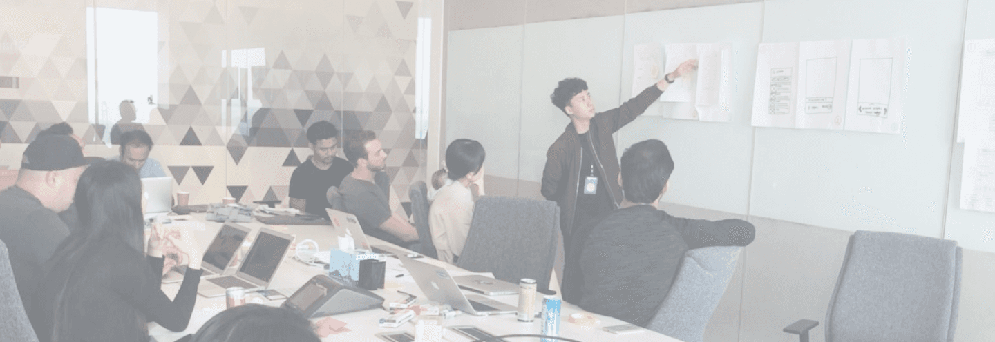
Workshop for GrabFoof Home design
Learnings
Teamwork is key
These experimental projects gave me valuable experience collaborating across multiple teams and verticals. Working with the Growth team exposed me to a wide range of user journeys and helped bridge the gap between GrabFood and GrabLoyalty, bringing the experience together more cohesively.
Challenges come in all shapes and sizes
Designing for growth often means looking at the journey from unexpected angles. By connecting the dots across small but meaningful touchpoints, we can guide users through a smoother experience and create outsized impact when everything aligns.
PREVIOUS PROJECT
Collection of Designs and Ideas
CREDITS
Anh Quan Huynh (Design Lead)
team
Grab Design (Deliveries)
NEXT PROJECT
GrabExpress Revamp (2020)


